The Re-Dream Foundation is a project focused on brand identity and printing techniques of visual communication design. The idea behind this foundation is similar to the concept behind "Make-a-Wish" foundation, only for adults ranging anywhere from 30 to 90+ years old. Through this foundation, applicants can potentially be chosen to be granted money or aid for a certain life dream that was never able t be accomplished due to a larger life issue, crisis, or circumstance. One may want to go back to school to earn a degree, while another may just want to go sky-diving. The possibilities are endless.
To the right is a logo that was crafted and revised for this foundation, using shapes and color differentiation to present a sense of transformation and movement. Keeping a clean, professional appearance with creative intentionality still present, this logo makes up the first part to the brand.
Technique wise, this element to the foundation helped me to better understand color separations of the printing process. We were instructed to print proofs of our logo in each color separation, such as CMYK, spot colors, and grayscale.
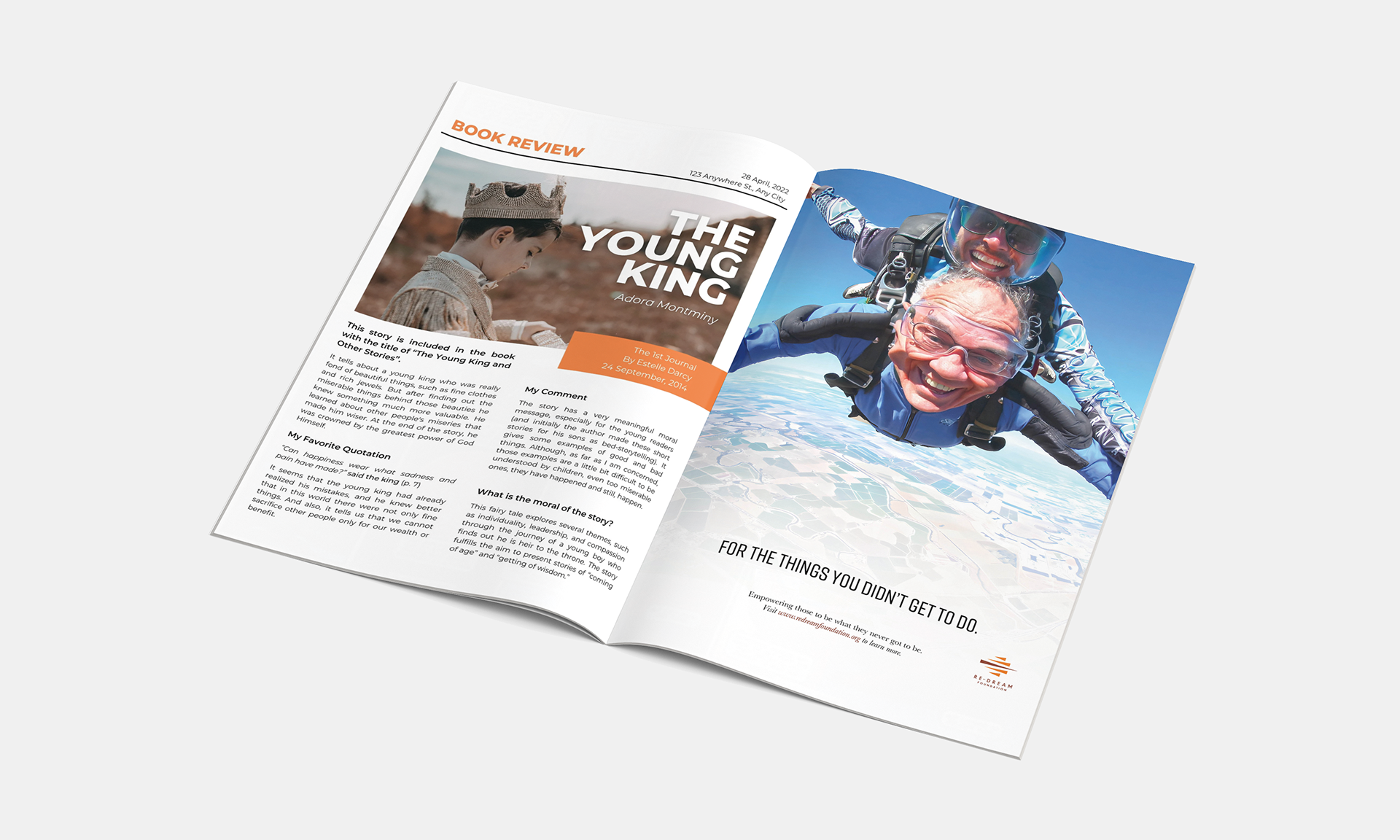
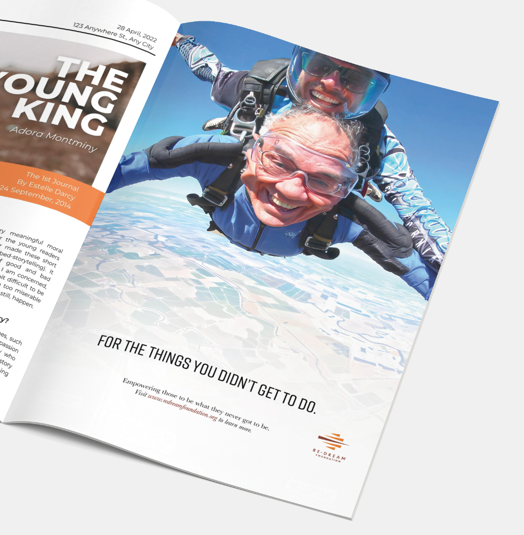
A magazine advertisement was created to further the Re-Dream Foundation's brand and messaging. Like I mentioned above, this foundation can appeal to a myriad of life dreams and i wanted that to be evident in the advertisement. With strong imagery and clear text to inform my viewer, this advertisement enhances the foundation's tone, mission, and purpose.
To better grasp printing techniques, this advertisement was broken down into color separations through proofs as well, but also constricted to an accurate bleed and trim line based off of magazine specs.
